Regulars:
1) What's hot and What's NOT!
2) Monthly horoscopes with our very own mystic Mel.
3) Ask our very own agony aunt Annie to solve all of your problems!
4) Most embarrassing moment 1-5.
5) Fashion fix!
6) This months gig reviews.
7) Concerts and gigs near you!
8) Have a sit down with our style editor
9) A week in the life of..
10) Top Tweeters this month.
11) Reader response, give us your thoughts on the mag!
12) Street style- the most stylish strangers about this season!
13) Girl guide.. this months MUST have items!
Features:
26) DOUBLE PAGE SPREAD- Artist name and quote.
11) Months giveaway- nail varnishes
5) On tour with Rihanna, the top totty tells us how to keep her crew intact in tour madness mode!
4) Free JLS, THE WANTED, 1D and NORBOYZ posters
5) BE WITHIN A CHANCE OF WINNING TICKETS TO SEE KATY PERRY LIVE!
6) Coral Girls single!
7) FREE posters of pops freshest girl group, 'The Coral Girls'.
Tuesday, 11 December 2012
Interview questions for my music magazines double page spread.
1) Have you always wanted to know you wanted a career in music or was it a bit unexpected?
2) At the peak of your career who would you aspire to be as successful as?
3) Where do you picture yourself in three years?
4) If you could win any award, one of your choice what award would it be?
5) What would be your dream collaboration and why?
6) Does any of your closest family and friends think it's crazy how quickly you've shot to fame and the extent of it?
7) What's the craziest thing a fans done for you?
8) Whilst were on the subject on fans what is the most random thing a fan has said to you?
9) Were approaching your next tour, how does it feel to have sold out the 02 arena for 5 nights solid?
10) How do you get your personal chill time whilst on tour?
11) In your opinion how have you stayed humble? what's brought you back down to reality with your alter ego as a famous goddess?
12) Can we get any hints as to who your support acts are on tour?
13) Have you got your eye on any upcoming artists or bands for us to look out for?
14) Who do you think still keeps it the freshest, musically wise of course?
15) Who is your biggest musical inspiration of all time?
16) Whats your favorite instrument to play?
17) How much does your family and friends mean to you?
18) BIGGEST CELEBRITY CRUSH?
19) Fave song in charts right now?
20) What has been your most diverish moment?!
Music magazine mood board

Fitting in with the overall genre of my music magazine (Pop) I have chosen these separate pieces from individual magazines in which I feel I would like to incorporate within my magazine. (Nicki Minaj, Katy Perry, Lady Gaga, etc are all pop artist and have all been presented in these magazine in a pop kind of fashion. Most of the colours are bright and intriguing, the camera angles are mostly medium close ups giving a good detailed view of the artist themselves. The double page spreads are uniquely set out yet still show an organised manner, enabling readers to navigate their way through the magazine easily. The double page spreads are large and lexically detailed yet using black and white pictures and fonts mostly they still capture my attention true to a pop magazine, therefore taking all of the magazine clips on my mood board into consideration gives me a good idea design wise when it comes to my magazine, also better knowledge of pop magazine cultures.
Magazine idea rest shots (Cover)
A sample of six taster test shots on this page show what kind of image I am looking for in the cover of my music magazine. Sticking true to medium close ups with the acception of some full length shots I got my model to due classic 'Pop' poses such as flicking her hair, spinning around, hands on hips etc. Something that as many of the readers of my magazine are females they can aspire to be, the typical girly look, making the models facial expressions also always happy and smiling again something classical to pop females, they way they are to be represented on pop covers, therefore the refined main image of my front cover will be something similar to these shots with more detail (and maybe colour in regards to the white and black backdrops, I may try some outdoor shots so that the scenery isn't so plain.)


Friday, 7 December 2012

Friday, 30 November 2012


Wednesday, 28 November 2012

Three music magazine analysis: Front Cover, Contents Page and Double Page Spread.
NME

Firstly the lead image shown on this NME cover says a lot about the artist. Firstly we're given the impression from his facial expression and the close up camera shot that he's not messing around, it's quite a serious shot, the artist in the shot has no smile on his face and his hands touching his face and his eyes wide open, this shows that he takes his music seriously, he's therefore being represented in quite a serious manner, this use also resembles the headline 'The Streets legend is back. Why so glum?' This makes readers want to find out why 'being back' makes Mike Skinner so 'glum'.
The colour scheme also shows quite a serious side, the organisation of the page also proves quite neat, the colour scheme matches well with the photography. Another classical technique is used on the cover with Buzz words 'Free' poster.

The features on the contents page always have numbers, article quotes and information about the article making readers want to read on, this pays clear attention to the features more so than the regulars which are based on the bottom middle of the page always, giving the readers a better understanding of what is being presented in the features rather than the regulars. This however does have positives to the magazine it shows it changing things up issue by issue they always have fresh features yet still their usual regulars such as reviews, gig guides etc, regular magazine readers therefore know what they're getting when investing in the NME contents page for navigation and new readers are easily navigated by the contents page.
Although the magazine contents is presented quite busily it's still easy to understand and has a organised look to it.
Another thing that is classic to the NME contents page is the opportunity for reader to 'Subscribe' this gives regular readers already subscribing a reassurance and new readers interested a chance to subscribe.

This double page spread on Mike Skinner again represents him in a serious manner, the photography firstly, his facial expression is plain, he's looking away from the camera as if it's not there, his fingers are in his ears as if he doesn't want to hear what's being said to him, we then get the idea that he's quite an independent artist, he doesn't listen to others suggestion, he rolls with his own idea.
By the Heading 'DON'T MENTION THE STREETS' we get an overall impression as to what the articles about, this presents Mike Skinner as a gangster figure, edging away from gangster or his roots, he doesn't want to have anything to do with them any more. The colouring of the heading and the text used is grey, this again has resemblance to the streets, grey concrete and bricking.
Mike Skinner overall being presented quite tough, hard to influence as he wants no mention of streets and independent.
Kerrang!

The cover of this page is very busy and loud. The photography says a lot about the artist immediately, the close up photography draws attention to the artists tattoos, on his neck and his hands, we then get the idea that the Bring Me The Horizon singer doesn't play is safe. His facial expressions isn't a smiling gesture just putting one finger to his lips as if to say shh, however although not smiling literally we get the idea that the artist isn't entirely serious, his eyes almost look asif they're smiling, it's a fun type of shoot, the shh gesture again relates to the headline of the cover 'The secrets behind 2013's most wanted album' so the gesture is simply just an idea of keeping the bands new album quite, these gestures could also transfer excitement towards the new album. The artist therefore is being presented in a fun/excited manner.
The colouring is very brightly chosen, reds, yellows and loud blues, this again relates to the photography, not gloom. As far as the other features on the cover go, the poster and the chances to win tickets again have the ability to get people to buy the magazine, something to draw the readers in if the lead image, band/artist hasn't already done so.

The contents page for Kerrang! Pays attention to both the regulars and features equally if anything the regulars more than the features with the exception of lead photography for the features.
The contents page therefore allows reader to see the feature with photography, giving the readers an idea of what to expect from the article.
The use of a editors letter and an opportunity to subscribe to the magazine used on the contents page also gives readers extra chances to read the magazine more in the future if they're not already regular readers.
The use of WIN on the photography and a chance for reader to win prizes within the magazine also gives the contents page an extra appeal, as it costs them nothing to enter the competition getting the chance to win something again for free would obviously be appealing, especially to the audience of KERRANG! magazine as it caters to a specific genre of music those reading would be interested in the bands/features and regulars included.

The colour scheme of this double page spread again is very bright using yellows/blues and reds, the main fonts are done in capital letter and bold font, relating to the photography of the artist, in the picture he is seen to be shouting, this therefore makes a good link.
The use of the photography showing the artist shouting shows him in a loud light, this could also be a reference to the type of music he makes. The medium close up also shows off his tattoos on a lot of the artists boys arms/hands/neck.
The imagery also relates to the quoting on the page 'I feel more clear-headed, more awake' which he is shown to be. The double page spread therefore presents the artist as loud, there to stand out similar to many of the double pages characterises colours/fonts/headings, all linking with the spread and information on the artist, yet at the same time stays true to the style of KERRANG! by adding the 'News' in the top left of the first page in red.

The photography of the artist Noel Gallagher uses a full body shot, allowing us as readers to get an overall view of him not just as a person but a musician his facial expression is serious this could also show a resemblance to his attitude towards his music, his body language and the way he is leaning on the speak with the quotes inside 'I ALWAYS THINK BIG' and 'GET OASIS BACK TOGETHER NOT EVEN FOR STARVING CHILDREN...' This relates also to his facial expression, he doesn't want to get back with his previous band, not even for a cause such as starving children, this could therefore show his stubborn side and his desire to be an independent artist, showing him in a independent tough light.
The use of the colours on the cover also contribute well to the lead photography reds, black greys and browns, the cover includes small article giving a taster of the content yet the exterior isn't too busy and packed.

All the features included on the contents page for Q have pictures and description with them in comparison to the regulars of the contents which are just numbered with description, this shows that the features are considered more important than the regulars yet both have enough description for readers to be able to navigate themselves around the magazine. The use of a main picture for the cover story also give Q magazine something different, by having a fresh cover story every issue it spices things up for regular readers whilst still keeping things traditional with the regular section.
Again Q contents has a Subscribe section of the contents page in order to give new readers the chance to become regular readers if desired.
The colour scheme on Q's contents page stays true to it's red and black style enforcing continuity into the magazine.

Q uses a photography image to take up the whole left side of the double page spread with a quoting of 'I didn't have a fucking dad' we instantly get the impression with the photography and quote combined that this article is more than just a musical article, artist Ellie Goulding here has gone into personal details of her life and past, something that fans may find interesting. The photography used is quite plain and simple it concentrates on the artist herself with a few light in the background yet still blurred, overall showing the artist in quite a stripped down vulnerable light, discussing topics she's obviously quite sensitive about.
Monday, 19 November 2012
Magazine Cover analysis (Vibe magazine).
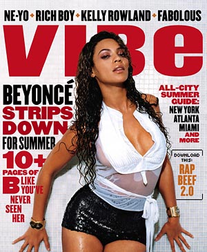
Instantly introduced to this magazine we are opened with a Lead Line of 'Beyonce strips down for summer' this links to the main image of the cover (Beyonce herself)- Showing a clear link between the text and the artist, also the way she has been styled represents her in a seductive manner, again linking back to the lead line 'strips down' the link between summer and Beyonce being shown wet is also present, this again adds to the seductive side of the cover as the water makes part of her top see through, this could appeal mainly to a large population of the magazines readers.
This way of representation appeals the artist (Beyonce) to the category of music in which this magazines readers listen to because it shows women as a whole in a certain way, hip hop and R&B especially, showing women as more items than anything else, there to draw men's attention and look nice (sexy) as Beyonce does on this cover.
Friday, 9 November 2012
Representation of girls in music videos.
50 Cent- Candy Shop


The instant reference of the word 'Candy shop' which indicates a house full of girls shows exactly what type of music video this is due to be from the get go.
It seems to focus on women as objects more than individuals, in this case as an aid of sex giving rather than anything else.
A lot of the costumes within the video are skimpy, tight, and red, the use of the red and the revealing costumes shows woman in an image of lust, symbolising sex love romance, but more so in this case sex.
The use of the word 'Candy' also shows women as treats, there for pleasure and nothing more, this is the overall image the it being portrayed through out the video.
Therefore the music video as a whole concentrates on making 50 cent the rapper look like a boss, look irresistible, having women fall at his feet, making other men jealous and flaunting all he's got.
Motley Crue- Girls Girls Girls


The Motley Crue represent themselves as womanisers in this video especially, sex obsessed and quite sexist, showing a form of hierarchy, representing them higher and more important than women, almost as though the women are they to dance and pleasure them for money whilst within the music video they can refer to them as 'Bitches' etc, treating them with no respect what so ever.
Again a video promoting themselves and showing women as objects to men and nothing more.
Sunday, 4 November 2012
Wednesday, 24 October 2012


Wednesday, 10 October 2012

Technical Skills- Colour Splash Tutorial.
http://www.slideshare.net/brittdoran_ox/technical-skills-colour-splash-tutorial


Monday, 8 October 2012
My CD Front and Back cover analysis.

For my CD's front and back cover I have aimed to create a Pop genre CD.
My cover is suitable for this genre because it's simple photography, quite toned down and pretty for a girls cover, another thing making it a female pop artists cover is the slim yet decorative title, in a light Serif font.
The cover is also although having a pastel colour range still quite eye catching, this is a selling point for the CD it showcases the artist entirely with the artwork.
The main strong points of my cover which work well I believe firstly is the lighting I used for the photo, It gives the Image the soft almost amber effect I was hoping to achieve, another strong point of my cover I believe is the outfit choice, the use of reds and creams I believe they all work together well adding to the overall image on the photography front.
I also believe the Light Serif font in which I have used on my cover also works well, similar to many female Pop artists I believe this gives a simple yet 'pretty' edge.
However always with what work there comes what didn't work so well.. In my opinion some factors of my CD cover that didn't work as well as anticipated were the detail of the image, looking back now I wish I had of added more emphasis to the lips of the artist, to make them more red matching the skirt, I also wish I would have dimmed down the appearance of the shadow back lay of the image, to start with I thought this worked well in contribution to the image, but now looking back it's something I would have changed.
The biggest difficulty I had with this project was adding different colours and contrasts to my image, in order to get the effect, and lighting colours that I wanted, as at the start of the project I wasn't very familiar with Photoshop however after experimenting with a few different alteration I came to a finished product which I was happy with.
Through out the project I've learnt how to get a better use and understanding of Photoshop firstly, I've also learnt how to experiment with different layers and special effects that contribute mostly to CD covers, effects such as PS brushes adding effects to my titles, (although I have not used them in my cover) I felt experimenting with them before hand gave me a better idea of what I was looking for.
Other covers of the Pop genre that I could compare my cover to would be:

The first album which I would compare my cover to is Shania Twain, although her art work is a full body shot like my art work it's quite plain and simple, concentrating on the artist itself, with a simple slim font.
2)

The second cover I've used to compare my cover to Is Britney Spears, I think this cover is very similar actually, the colouring is very similar and as is the font, as well as being a Sarif it's extra detail to some of the letters on (the swirls) are very similar to mine, the posing of the model is also quite similar, as is the skin tones/contrasts etc.
3)+BB.png)
+BB.png)
The last cover which I have chosen in relation to my cover is Taylor Swift, again with similar slim line font and placement, I think the thing that most relates to my cover with this one is the background lighting, it gives the same effect as mine, with orange/yellow tones.
Thursday, 4 October 2012


College Magazine Interest
1)
http://issuu.com/sparkzine/docs/spark_-_may_2012

The first magazine I saw which I liked in contribution to ideas for my college magazine was this one, named 'Spark' I believe the cover is eye catching, this I like about the cover, it has the ability to draw people in due to the opening graphics, I think this will appeal to girls more so because it appears to be very fashion orientated, quite poesy and pretty. It work because without even having any headlines on the magazine about the inside stories I already want to read on just from the detail that I've seen on the exterior.
What I'd mostly like to borrow from this magazine and use as my own is it's picture/imagery characteristic, I like the sort of pose and dressing of the cover girl, the background also looks almost intriguing even though it appears to be quite blurred. This is the type of effect I would like to incorporate onto my magazine.
Also the design of the cover and it's writing (Title 'Spark') Seems quite simple yet at the same time again intriguing, giving the idea that less is more, it's simplicity makes me want to read on, it gives the idea with the lightning strike on the bottom on the 'Spark' that although it appears simple to begin with it has much more to offer.
2)
http://issuu.com/umtxfl/docs/um_issue_59

Secondly I liked this magazine as another idea regarding my college cover, similar to the first link the imagery of this is set outside, giving a woodland type background, mostly what I like is the colouring type of the image, the colours of the outfits especially are calm, pastel soft and intriguing, yet at the same time as being calm they're bold. It gives the idea of high fashion which I believe will appeal to college students. I may borrow from this magazine the outfit and make-up design, it really did draw me in and I'd like to create a similar effect on my magazine. The text type at times is quite heavy, yet on the 'Um' part of the cover looks a little script, I believe this shows a nice variation which again I also may consider in my magazine, another thing I especially like about the text on this cover is it's very bold, you know exactly what you're getting and it has the ability to draw readers in immediately but the look of the headlines alone.
3)
http://issuu.com/avenueinsider/docs/030112

The final magazine cover I saw which I liked was this one, 'Avenue'. I especially liked this cover because it shows again a fashion edge which as a cover I think will appeal to a student population, especially a female population.
The text on this, the titled headline especially is quite thin and simple, light looking which I think gives the magazine a simple and feminine side, The use of one of the headlines overlapping the main picture is also interesting and different to anything I have seen before, this could prove a good technique again to draw readers in. For my magazine from this I'd most likely borrow the scene, where the picture is set, it looks quite urban and student like, from the blurred background of the picture, it's depth of field draws you in to look at the picture, almost like it's there especially to be seen.
Tuesday, 11 September 2012
Album covers (Research)
Album cover research.
_________________________________________________________________________________

Ed Sheeran- Plus.
1) I think this album cover relates to the music, firstly because the colour orange is referred with Ed Sheeran a lot and also because it's just quite plain and simple, it has only a picture of him so the imagery straight away is very pain and simple, which relates to his music which is again very quite plain and simple, it's not about the appearance, people do not like him because of how he looks, they like him because of his talent, therefore the cover has been stripped down to basics, similar to his music which concentrates more so on vocals and accuracy.The text placement down the right hand corner again seems quite simple and plain yet quite thick and bold, so still showing the focus of the album.
The photography isn't greatly clear and focused yet you still see what you need to see, the basic idea of having him on the cover so that those buying into the album know the artist they're getting.
Ed Sheeran's genre which is acoustic is again very plain focusing on what is already there, and not adding any overly special effects, which is what I believe the cover reflects.
_________________________________________________________________________________

Frank Ocean- Channel Orange.
2) Again this album cover relates well to the musician (Frank Ocean) again because his genre of music which is R&B with a vocal twist, the vocal twist means that most of his music is very plain and simple, stripped down to his voice only with the occasional addition of keyboard, there's no fast tracks included in this album therefore it's simply about his voice, show casing his talent, therefore the cover of the album (the channel section) may relate to his voice, the real beauty of the album. In other words the album cover doesn't have to say anything because his voice speaks for itself.
The cover therefore is not the average R&B singers album cover, the photography is non existent, it's back-grounded in the colour of the album name and the title, this again stripping the album down to basics, the covers placement of text is straight in the middle of the album, almost as though it's the albums main focus, this therefore shows the message of the album, yet still very simple.
_______________________________________________________________________________


Rihanna- Talk That Talk.
3) The final albums I have chosen were Rihanna's 'Talk That Talk' album covers.
These both relate to the music well because the covers are both a bit risky (which the music on this album also is), which is different to her previous albums, so by her blowing smoke in the black and white album and doing a different pose to the 'girly girl' previous albums shows the changing of her music, so the resemblance from the change of her appearance also relates to the change of her newer more edgier music.
Rihanna's genre of music in very broad she's known to experiment with all kinds, such as: pop, reggae, R&B, dance, hip hop therefore this albums showcases a variety, which is a bit different, therefore that's why the album cover proves a bit different to anything she has done before.
The albums placement of text again shows an edge to the cover, in the first cover shown, (the colored cover) the album title has been made to look like a tattoo on Rihanna's arm, this could be controversial, especially to a musician with a variety age group of listeners, again showing a different more edgier side to the singer.
The placement of text in the second cover (black and white) isn't so edgy yet still in capital letters breaks away from the usual 'girly girl' thin writing known for many female artists covers.
Photography wise the covers are very outstanding, the photo is the main focus of both the albums, you already know what you're buying into straight away by the cover, the photos almost represent a mean looking image, maybe saying that she's breaking away from the usual, starting something different, going down a new route.
_________________________________________________________________________________
Subscribe to:
Comments (Atom)